this single post is more useful to me then four years of art school
We did it in color study class on my college and it’s incredible the difference between using red/blue/yellow than cyan/magenta/yellow.
The purple was colored like shit, so as the greens. Than we tried the actuall primary colors and it FELT SO GOOD!
I JUST TESTED IT IN MY ART PROGRAM AND HOLY SHIT
IT WORKED REALLY WELL
On the left we have dissapoinment; on the right, love.
Then why do they teach us that RBY are primary colours in Pre-KG????
To mess with our heads….
Or because they think that cyan and magenta are too difficult for kids to learn? Lame either way
Reshare to save lives
Okay, no. No no no no no no no no NO.
Listen up you fucks because I’m not wasting thousands of dollars on an art degree to watch y’all fuck up basic color theory.
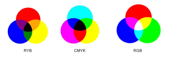
Red, yellow, and blue are the primary colors
If you’re using p i g m e n t.
Do you hear me? When you’re using traditional media, fucking actual goddamn paint, Bob Ross style, your primary colors are!
When you use paint, your primary colors are red yellow and blue and don’t forget it.
NOW THAT CHANGES COMPLETELY WHEN YOU GO FUCKING DIGITAL.
THE DIGITAL PRIMARY COLORS ARE RED BLUE AND GREEN IF AND ONLY IF YOUR WORK IS GOING TO STAY DIGITAL, ON THE SCREEN, AND NEVER LEAVE THE SCREEN, AND OF COURSE IF YOUR WORK IS GOING TO BE PRINTED. ON A PRINTER. WITH INK. THEN. AND O N L Y T H E N.
ARE YOUR PRIMARY COLORS.
CYAN.
MAGENTA.
AND YELLOW.
So say it with me folks!
Red yellow and blue, are the primary colors for traditional pigment that’s mostly used in paints and shit. You use red yellow and blue when you’re painting traditionally, Bob Ross style.
Red blue and green is light, which is what you’re painting with when you pick up your tablet and go digital.
CMYK is ink, and ink only. You could use cyan, magenta, and yellow as your primary colors in paint if you wanted to be a complete dick, but they’re not your primary colors unless your work is going to be printed using. i n k. The only time they could be considered the primary colors in a traditional medium is if you’re using ink.
Good day.
Also thatswhiskytoyou’s color mixing is bullshit because THIS:
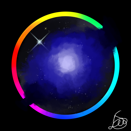
Is my icon. I painted this using RED. GREEN. AND BLUE. AS MY PRIMARY COLORS and they turned out fine. Of course, I used the finger smudge tool first and then the color mixing tool and then the blur tool, but hey what do I know.
Clearly using the blur tool only doesn’t cut it.
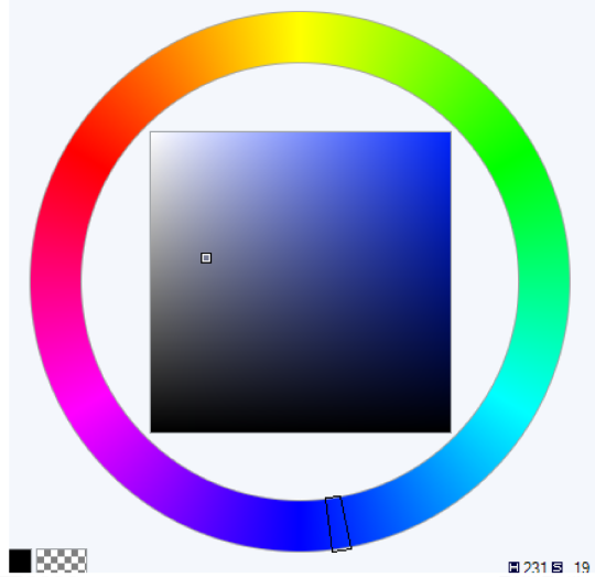
“Oh but Leo!” You say. “You used cyan and magenta in that color wheel!”
Well bitch guess what.
this is the digital color wheel. I’d say I mimicked that pretty well, don’t you think?
Oh and one other thing, notice how Blue and Yellow are directly opposite each other on this color wheel? That’s because we’re dealing with light, and with light, yellow and blue are complimentary colors.
Which is why when you mix them, it looks like this:
Which is a pretty neutral gray tone: They cancel each other out on the rgb color wheel when you mix them together.
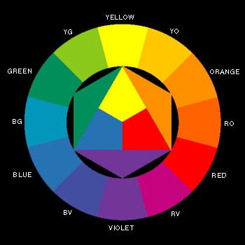
BUT WITH PIGMENT THE PLACEMENT IS DIFFERENT
If you’ll notice, yellow and violet are now opposite each other, meaning they’re complimentary colors and if you mix them, they’ll make a neutral gray.
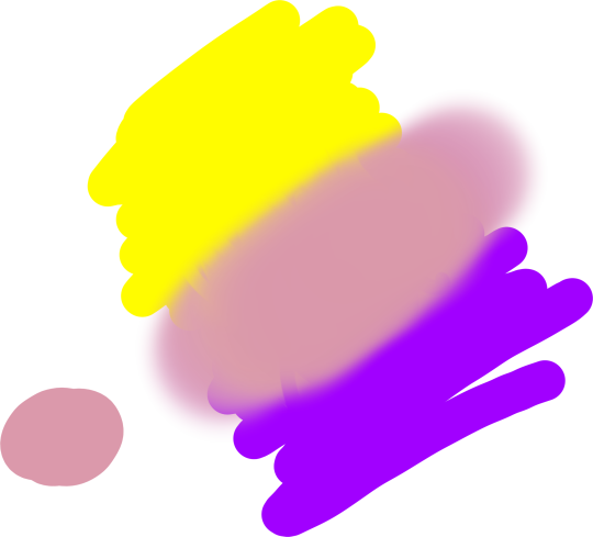
But if you mix yellow and blue, same colors as before, YOU GET THIS:
Now keep in mind that the person in the video uses a darker blue, so they get a darker green, but the point is that it doesn’t make that neutral gray.
Now what happens when we mix yellow and violet paint?
Ah yes, you get a bunch of muted colors the more evenly you mix them.
What happens when you mix yellow light and purple light?
I see, I see.
OH AND ONE MORE THING.
They didn’t teach you about red blue green and cmyk in pre-k because when most of us were in pre-k digital art was still in its early stages and what fucking seven year old knows how to use a printer.
GUESS WHO’S NOT FUCKING DONE YET:
The reason the primary colors for light are so dramatically different from the primary colors for paint and ink is because your eye only receives combinations of red light, blue light, and green light. Our eyes do not have a sensor (cone cell) for yellow light. So when we paint with light, red green and blue are our primary colors. Because of our eyes.
Furthermore, paint primary colors are colors that cannot be created by mixing other colors together. For paint, they are red yellow and blue, because you cannot mix orange and green to get yellow. Mixing orange and purple paint does not make red. And mixing green and purple paint does not make blue.
Mixing blue and green paints will make cyan. Mixing red and blue paints will make magenta.
That’s why cyan and magenta aren’t primary paint colors.
However, you can’t mix yellow and blue ink and get cyan. You can’t mix red and blue ink to get magenta.
And that’s why cyan and magenta are the primary ink colors.
Brighter and stronger paints are created through tints and shades, through a thorough understanding of color theory and a few quality paint recipes. Not by bullshit posts on tumblr designed to mislead you.
I was having Strong, Misspelled Feelings about this on Twitter and came to two possible conclusions.
EITHER
many young people on Tumblr did not have the opportunity to play/engage/mess around with color as young people. They didn’t have fingerpaints as babies; they weren’t encouraged to play around with food coloring at home; their art teachers were nasty and strict and told them not to mess up the supplies by mixing them. They never got to play with modeling clay, or colored cake frosting, or melting ice cream. They didn’t hold clear colored candy wrappers up to the light to see how light works differently than pigment. They didn’t get to experience color under their hands! Until the day they taught themselves digital painting, they genuinely didn’t have access to this understanding of color. They’ve built it from the ground up, so they don’t know any better!
Which is so sweet, and so sad! It also excites me, because imagine how cool it is to learn the difference between light and paint at an older age when you can really appreciate it. Also, how can we make the experience of color accessible to more young people?
OR
many young people on tumblr are happy to overwrite their own lived experiences/observations in favor of a more interesting hypothesis. These people HAVE played with colors throughout their childhoods, and have successfully made green by mixing blue and yellow paint as toddlers. They HAVE been told in school about primary and secondary colors, and the difference between light and paint. An adult in a physics or theater class spent precious time explaining why plants are green, and why gels on lights need to combine in certain ways to create different atmospheres. They DO actually “know better.” But they are happy to discard this knowledge in favor of something new. Which has its charms, and is a flexible way of thinking, but can also lead to the odd belief that schoolteachers are engaged in a conspiracy to bury the existence of cyan and magenta. This belief could easily be disproved with memory (”have I made ever made green before in my life?”) or experimentation (”what if I make green now?”) but which spreads faster than memory.
Which is very fascinating, because it’s more evidence that you can manipulate subcultures quite easily with a conspiracy theory if you use the right language, graphics, gifs and platform. You can erase their own lived experiences and their own knowledge of how the world works! You can get them to disbelieve the evidence of their hands and minds and memories, and replace that with a conspiracy theory, if you can present it as Marginalized Information! You can get them to believe that magenta is a primary color! Holy SHIT!
OR POSSIBLY BOTH.
Maybe I can combine these to manipulate people on social media to fund my conspiracy-theory-based True Colors of the Rainbow kickstarter, which will create Newton color wheels mounted on spinny things, and deliver them to classrooms!
Fig 1. A Newton color wheel (any reasonably balanced ROYGBIV rainbow presented in circular format, such as an umbrella, or a painted paper plate if you’re cheap) mounted on a spinny thing. If you spin a Newton color wheel, it will appear white. This is because white light is a combination of all the other colors of light.
Stretch goals include the Rainbow Conspiracy Learning Package, which will include colors of paint that children can mix to make black, and the Educational Reform Package, which will reintroduce concepts of art and science to educational curricula in interesting and accessible ways that aren’t slavishly devoted to standardized testing.